[House is currently under contract but we’re accepting backup offers at this time]
Over the last 2 months, we’ve been updating a single level house in San Juan Capistrano. We love this type of houses that appeals to a wide range of buyers with their good locations and family friendly layouts.
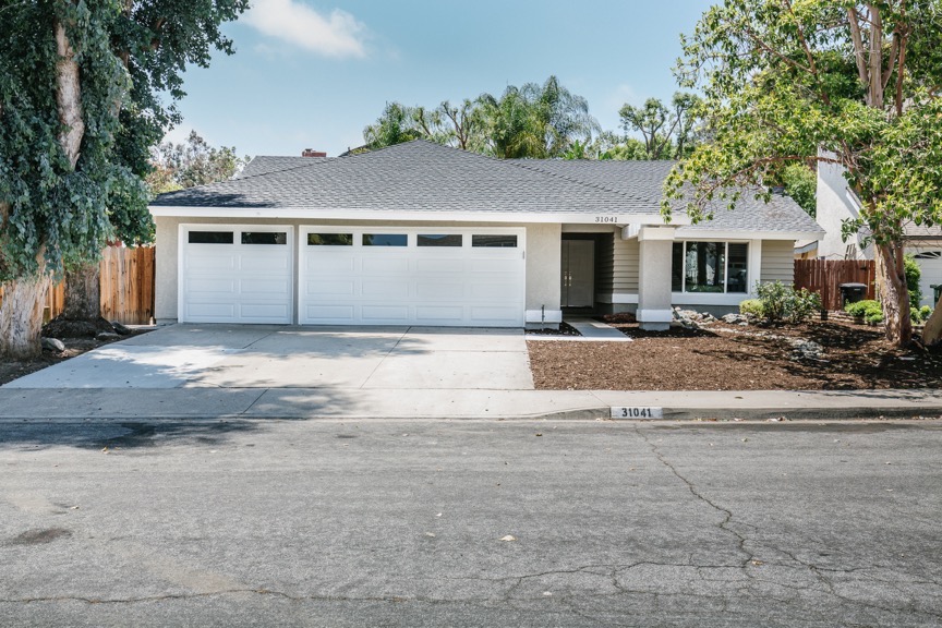
This house, at 31041 Via Solana, San Juan Capistrano, is located walking distance to sports fields, horse trails and a nice bike path that goes all the way to the beach. What more could one ask for when it comes to Southern California living.
Having worked on this floor plan before, we were excited to have a second shot at rehabbing this layout and improving on our previous design to create a higher end product. We’ve had several emails asking what we had done and what the before and after of this house looked like and so I’ve decided to make this post about the rehab process.
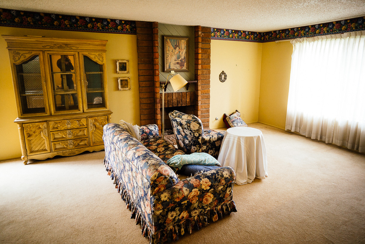
When we first bought the house, it was very much in its original condition. It had great bones, but just hasn’t been updated in awhile. This is the type of flips we like the best because the work doesn’t scare us. Either way the flooring needs to be redone, house needs to be repainted, etc, so and older home is just fine. We find the stark difference between the before and after rehab very satisfying.
In this case, like many of the houses we buy, the previous owner left some furniture behind, which is perfectly fine for us. We generally give our crew dibs on anything they might want for their own homes. Then we bring in the Salvation Army and a dumpster to take care of the rest of the items.
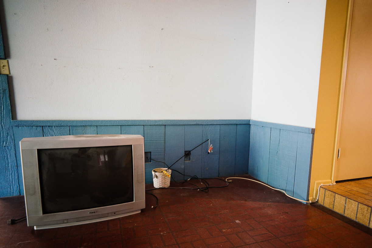
An item we hate dealing with are these old televisions. No one wants them even if they are working and they’re hard to dispose of because of the size, weight and the fact that it takes the waste disposal company a special trip to collect these old televisions, but old televisions like these are a staple in almost all the old houses we rehab. So if anyone knows of a use for these old televisions, let us know and they are all yours.
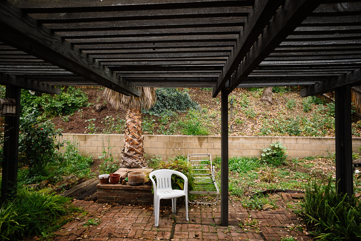
One cost that did throw us off budget was the amount of termite damage there was. The house had these old patio covers that were severely rotted. No worries, we just tore them down as we had planned to do. Beyond that, we were just expecting the regular amount of termite damage for a house of this age. But as we got deeper into the woodwork, there was just more and more and more damage that had to be corrected, which really surprised us since the previous owner had mentioned that the house had been on a annual termite treatment plan. Oh well, surprises like these are just part and parcel of flipping.
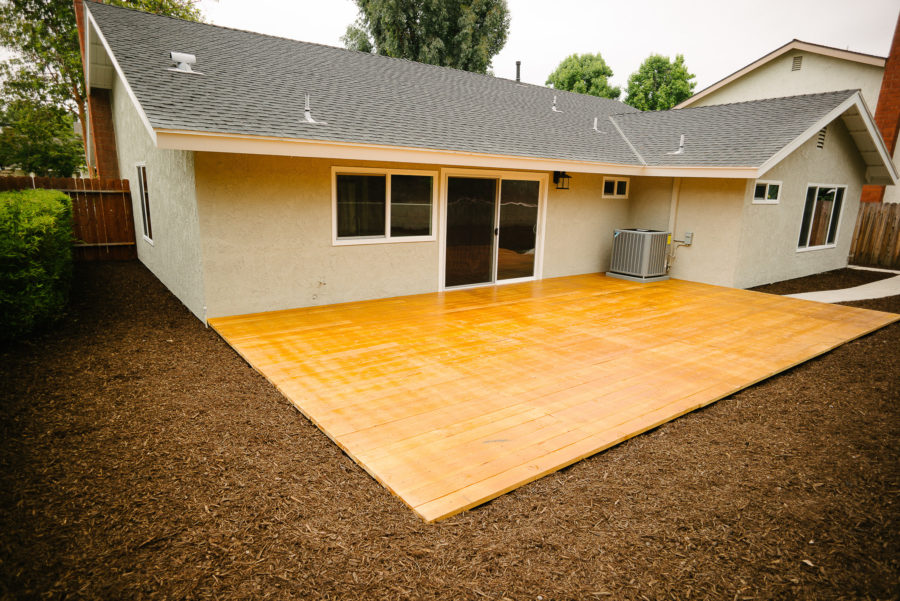
After tearing down the patio cover, the backyard was a pile of uneven bricks and hard to use as an outdoor space. So it turned out the most cost efficient and the prettiest solution (to me anyway) was to put in a wooden deck. I’ve always loved the feel softer, warmer feel of a wooden deck, so I was pretty happy to add it to this house. The above picture shows the cleaned up backyard and new deck.
The second big surprise for us was the cost of asbestos remediation. We had known from previous projects that some of the ducts have asbestos insulation, but we just didn’t realize how much. Our contractor had mentioned that the asbestos was safe as long as we didn’t disturb it, but we didn’t feel good selling a house knowing it still had asbestos in it, so all the asbestos had to come out.At the end of the day, expensive as it was, I saw it as money well spent if it means I sleep easy at night knowing the family that moves into our house is getting an asbestos free home.
Since we were redoing all the ducts in the house, we decided to just install a new furnace and an AC unit which the new owners would certainly appreciate if we end up with a hot summer.
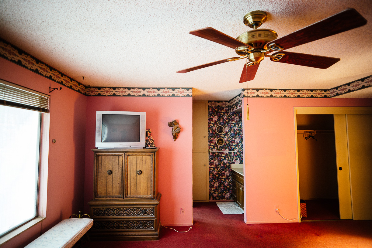
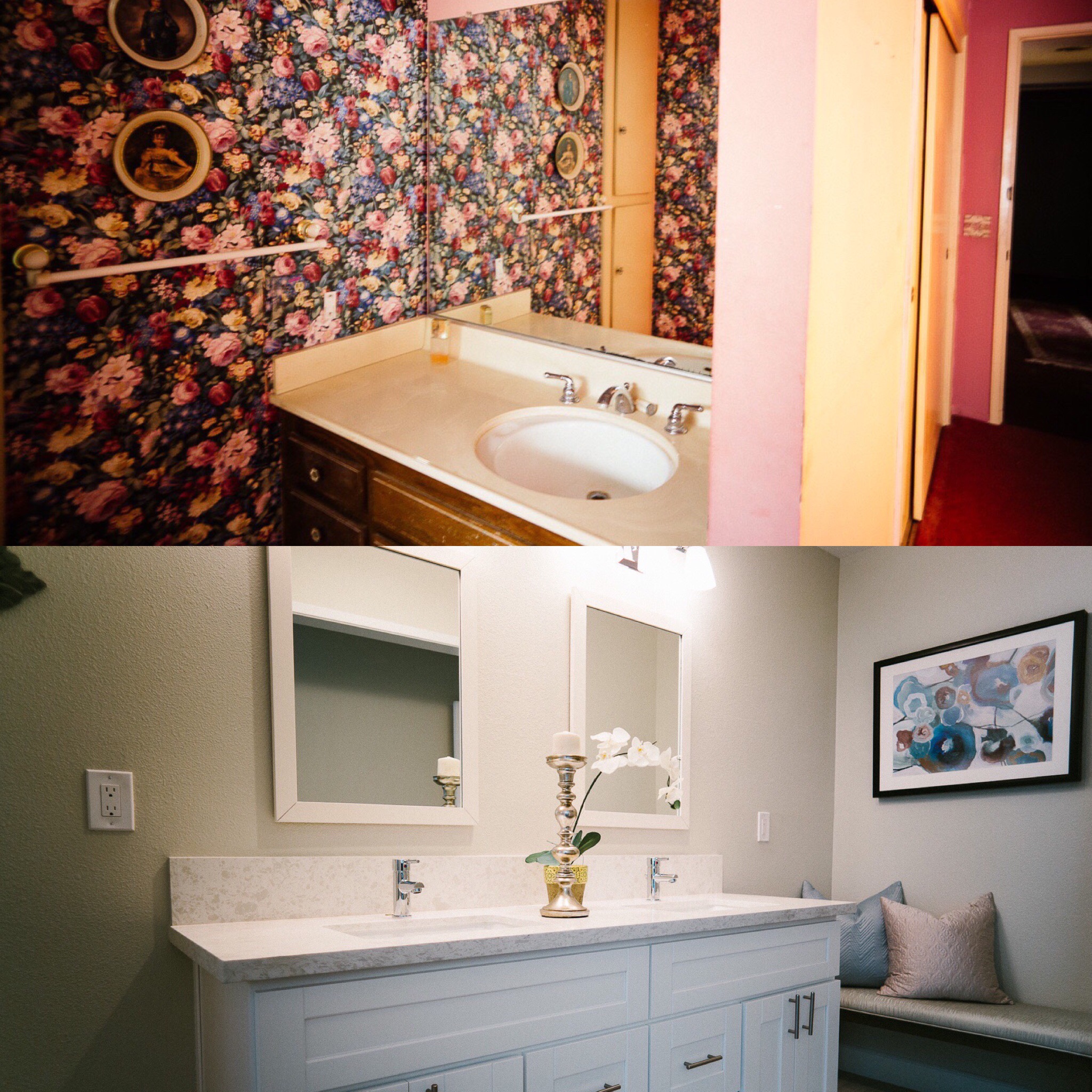
A third surprise was the difficulty of removing the wallpaper. Modern wall paper for the most part is fairly easy to remove, however, old wall paper, one that has been on for decades, is much much more difficult to remove. I’m not sure if it’s the age or the glue that they used back then, removing the wall paper ended up taking many more man hours than we expected, and the amount of drywall patching after was enormous.
Between the wallpaper, termite damage and asbestos, it cost us an additional $15 000 more than was budgeted. Ouch! But I’ve since come to learn, sometimes there is no way around problems but to pay and get it done.
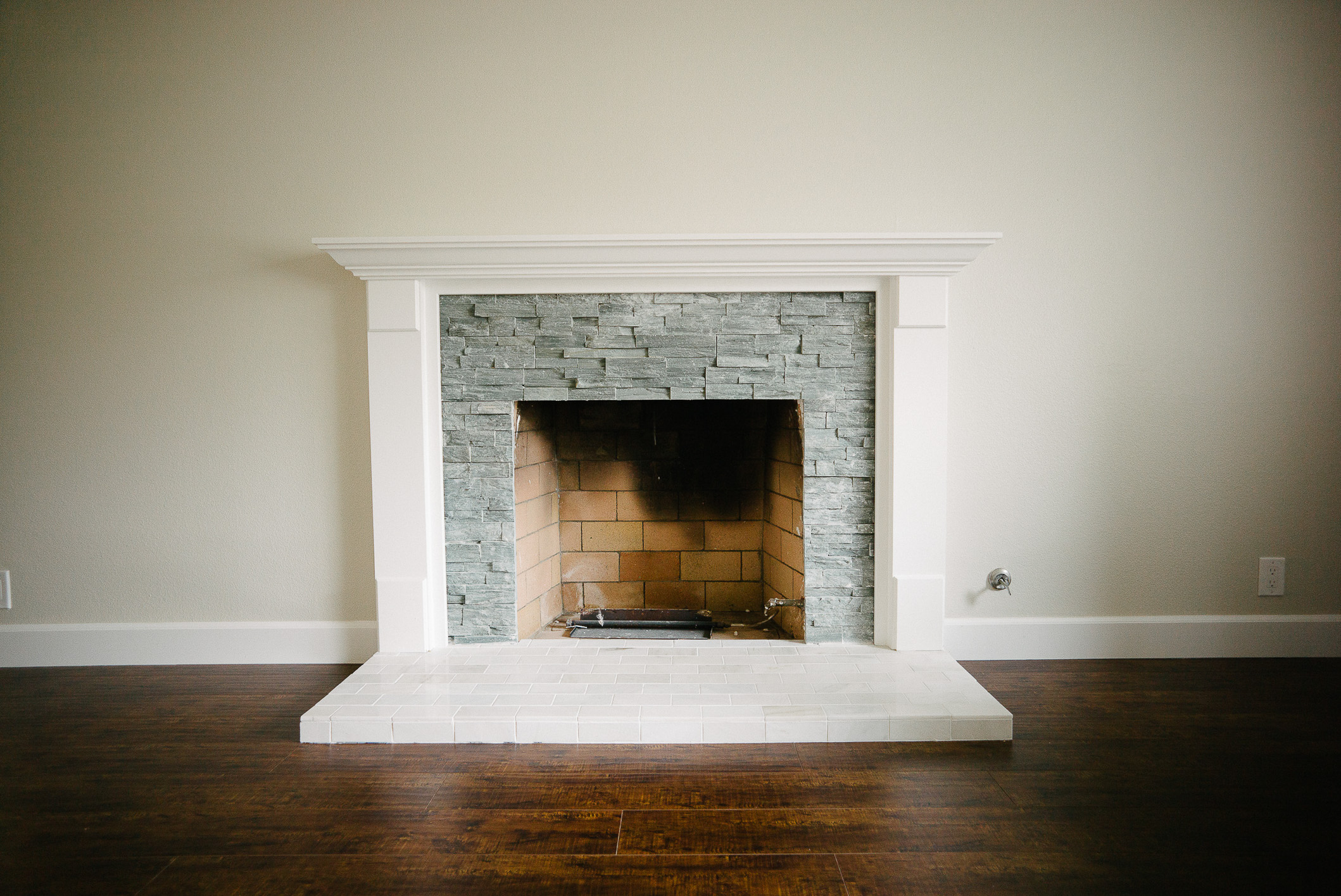
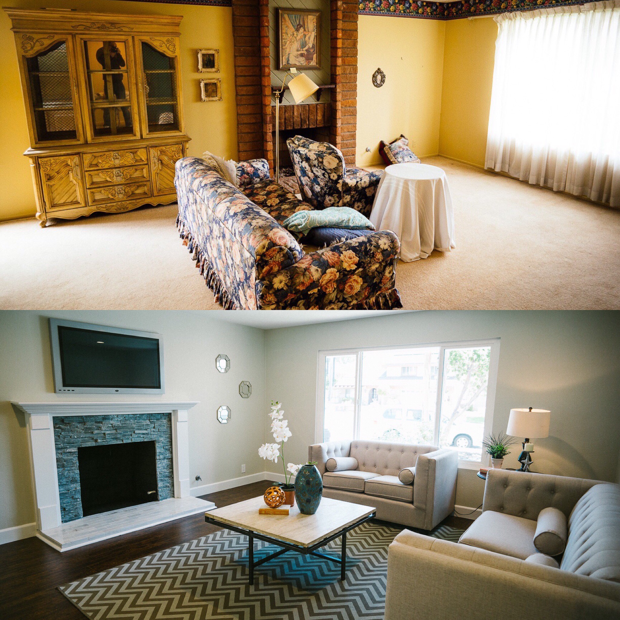
In the living room, the old brick fireplace was really dating the look. This wasn’t one of those brick designs we could paint over, so we had to tear out the fireplace and put in a new one. The local supply house was having a clearance sale on stacked stones, so we bought up all the inventory and made a stacked stone fireplace.
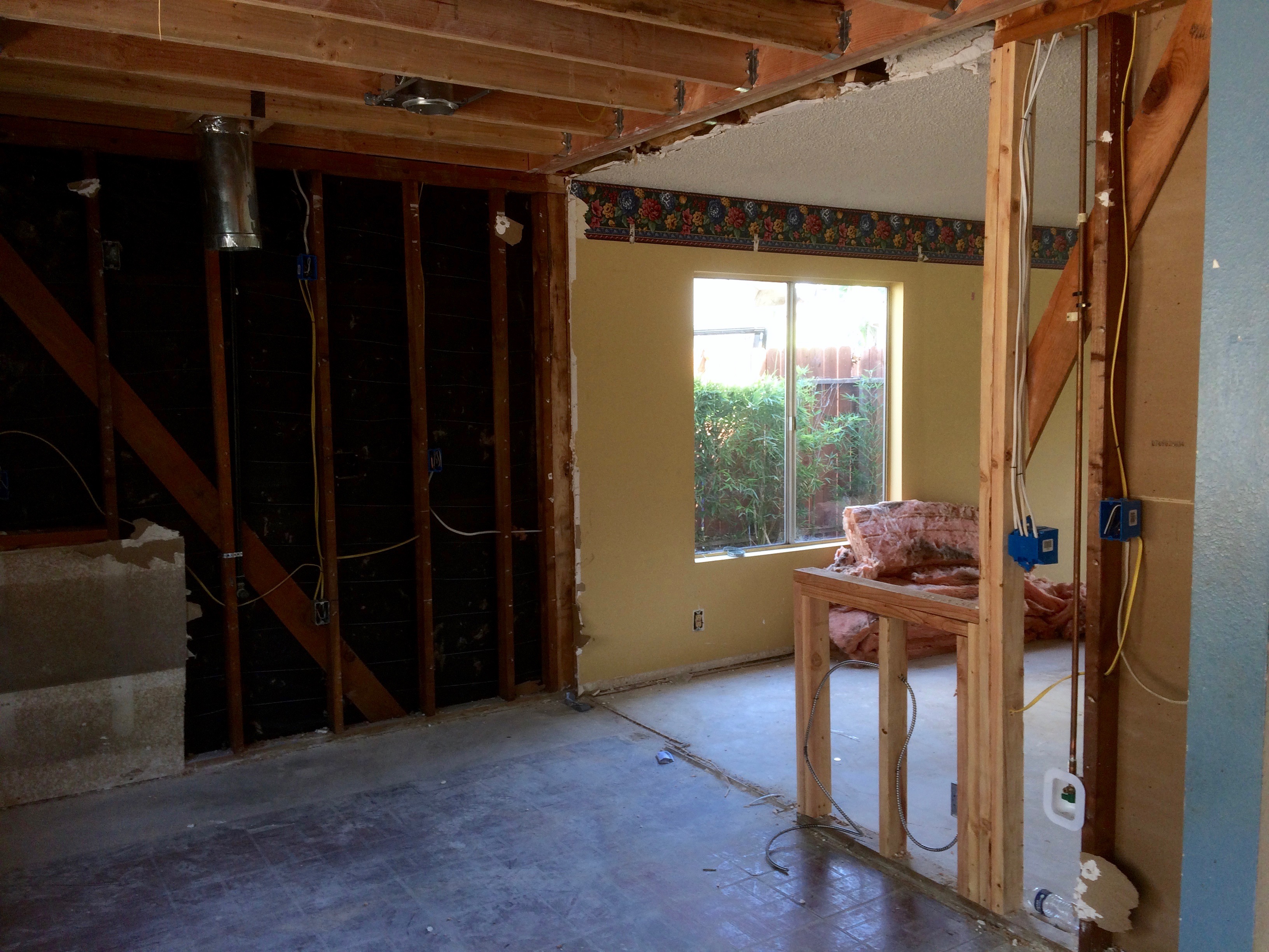
Houses from this era tended to have smaller kitchens, especially compared to the current trend of having massive kitchens that have an open layout to the rest of the house. We were debating as to whether to open up the kitchen in this house. I had recently read in some articles about design trends where homeowners are favoring closed off kitchens again because they want to close off the view of the mess in the kitchen from the guests in the dining room. At the same time I was juggling the opinions of the realtor and contractor versus the cost of the project.
In the end, I felt keeping the closed off kitchen was a little ahead of the demand curve, so I ran with the open design and had the contractor build a pony wall so we could increase the countertop area and open up the kitchen to the dining room.
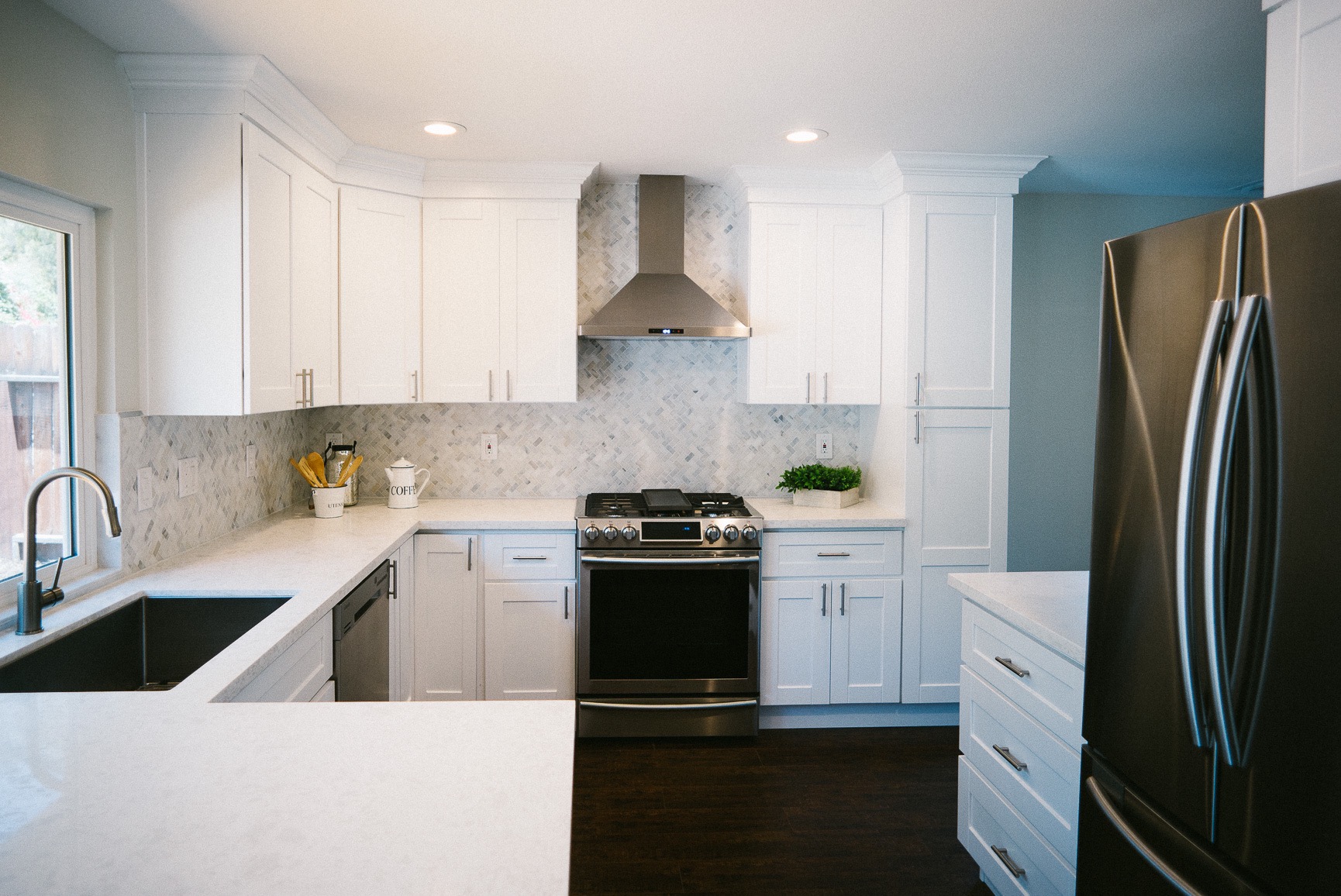
For the kitchen finishes, we ended up using shaker cabinets because they are all the rage now. However I believe it is a design that will stand the test of time. We used quartz countertops that have a nice wavy gray pattern. The other design elements of our houses include large single bowl kitchen sinks, stainless steel appliances and chimney vent hood. This house was the first time we used Samsung appliances and I have become quite a fan of their appliances due to their modern design and thoughtful functions.
This year, we’ve gone with a white and grey color scheme, and the backsplash is a marble herringbone tile. I’ve learned from this project that in order for a herringbone pattern to really stand out, the individual tile needs to be fairly large. The tiles in this design were 1×3 inches each, making it hard to see the herringbone pattern from a distance. Live and learn.
Like all our other homes we put in recessed LED can lights to meet current energy codes and used water saving faucets.
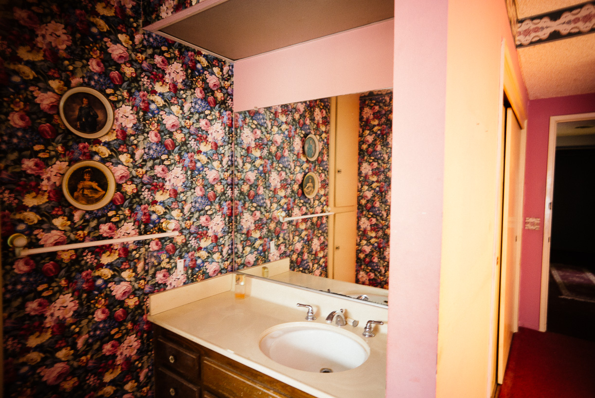
Similar to the kitchen, the bathrooms of that era all tended to be really small. From our previous projects, we’ve come to realize most buyers nowadays expect a double vanity with plenty of countertop space.
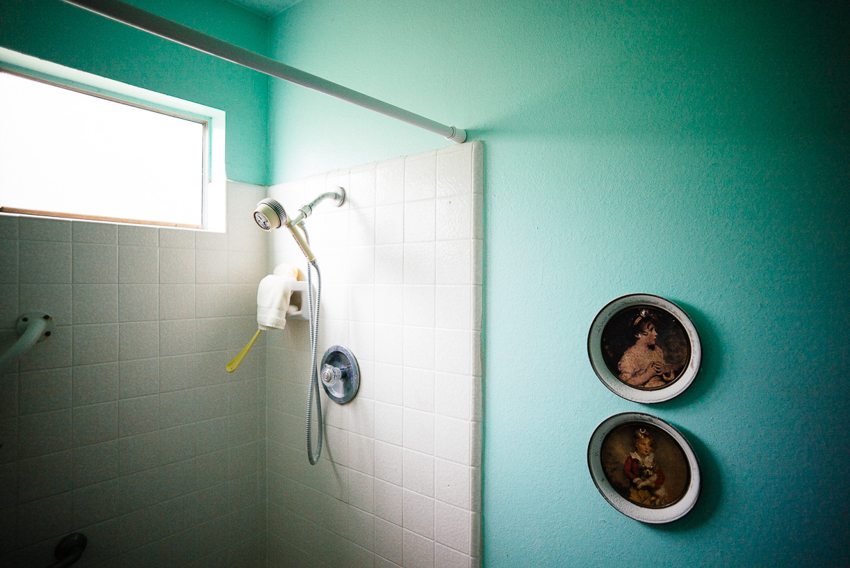
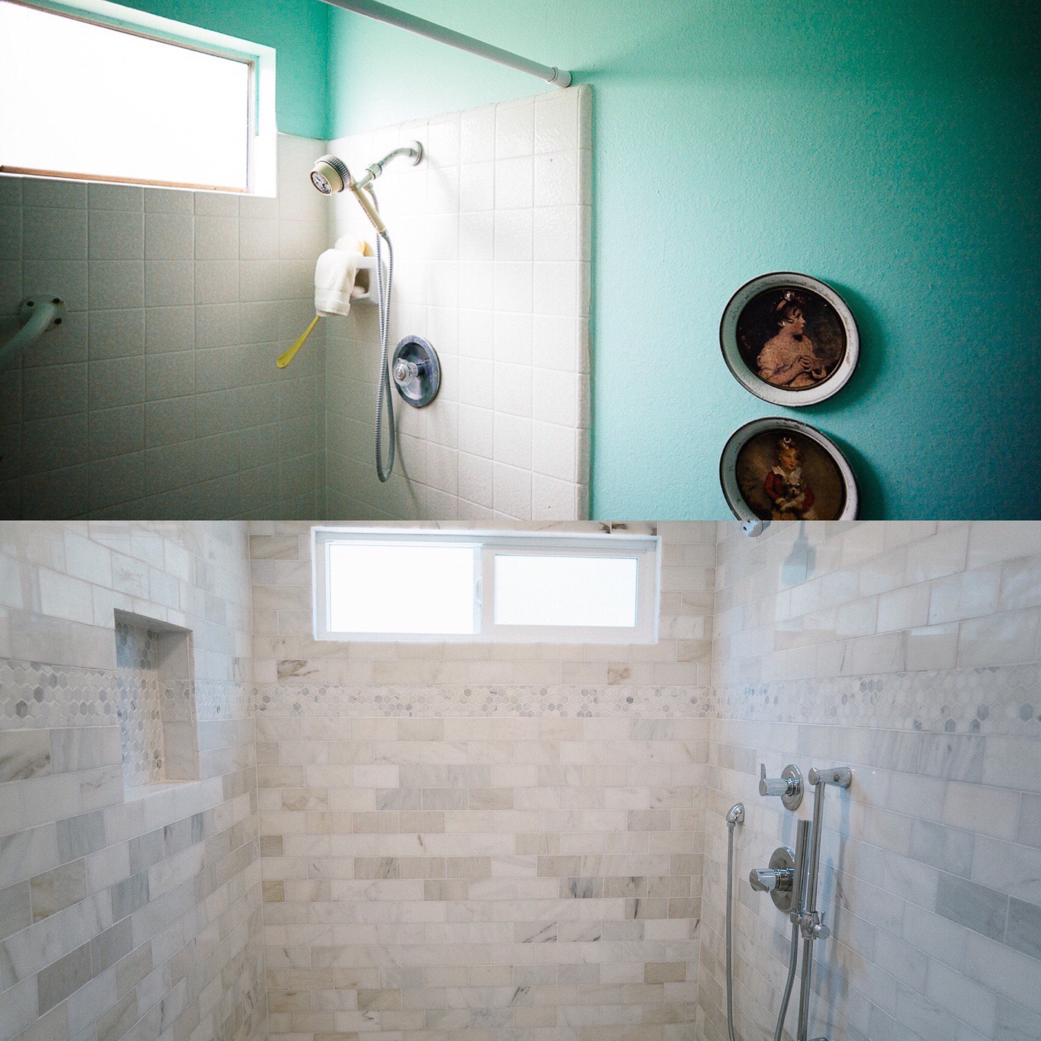
Current buyers demand a large shower as well. The old tiny shower just doesn’t cut it with buyers any longer. The result of this meant the master bedroom and bath had to go through some serious reconfiguration to meet current taste. Thankfully all the walls in this space were not load bearing so reconfiguring them were not difficult.
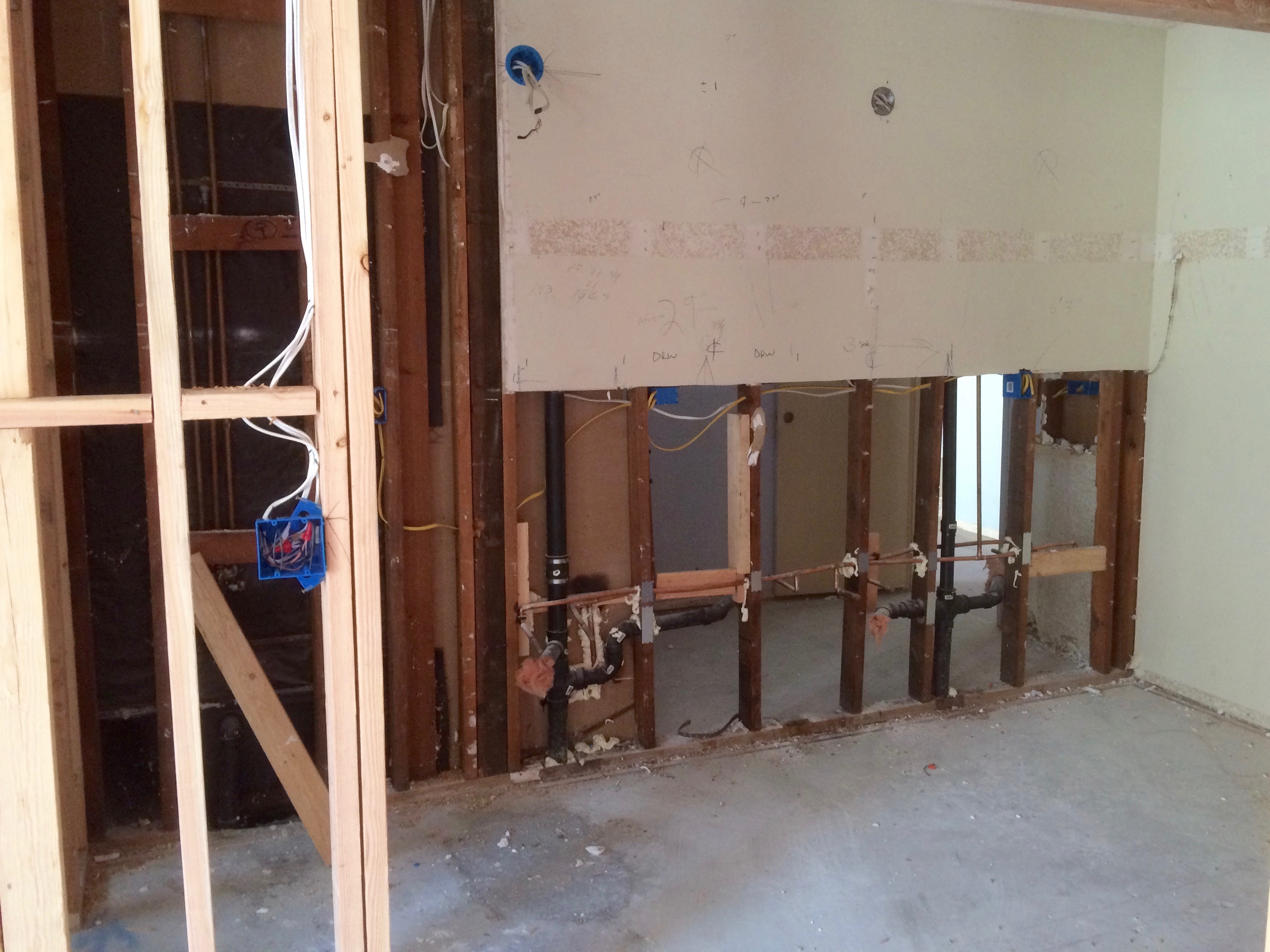
To accommodate the new and bigger master bathroom, we expanded the bathroom into the closet and moved the closet to a different wall. The meant taking down the partition walls between the vanity and the closet.
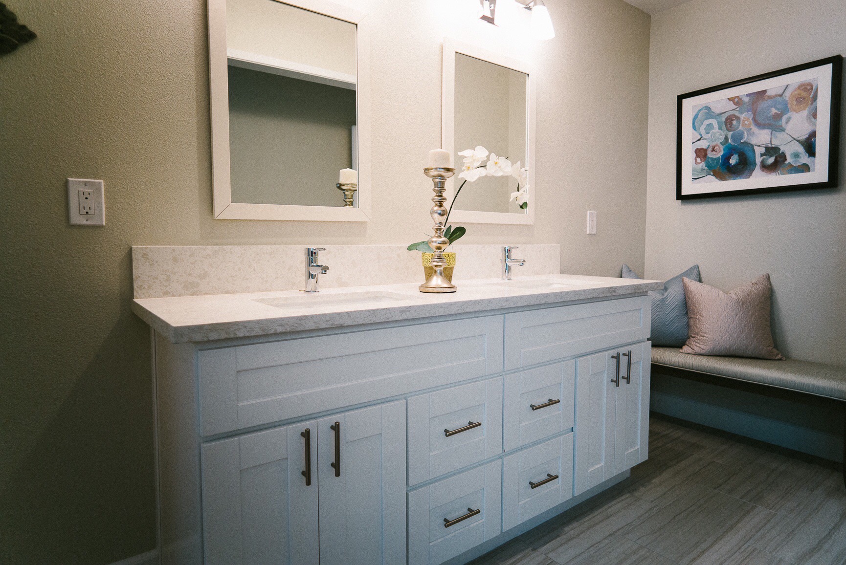
But the end result is that we now have plenty for space of a nice large vanity with a double sink and some bonus space for the new owner to add shelving or customize to their own needs. We used the same cabinet design and countertop from the kitchen to give a sense of continuity to the design.
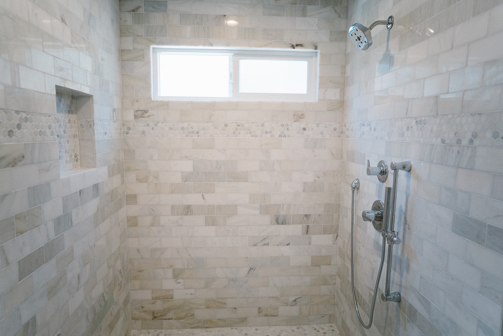
And we built a massive 5ft x 5ft shower in place of the tiny old tub. To add to the sense of luxury, we tiled the walls with marble subway tiles. Ok, maybe the marble was a little expensive, especially since we were already way over budget, but over the years, I’ve realized that it would be penny wise pound foolish to stop just short of fully executing a design concept.
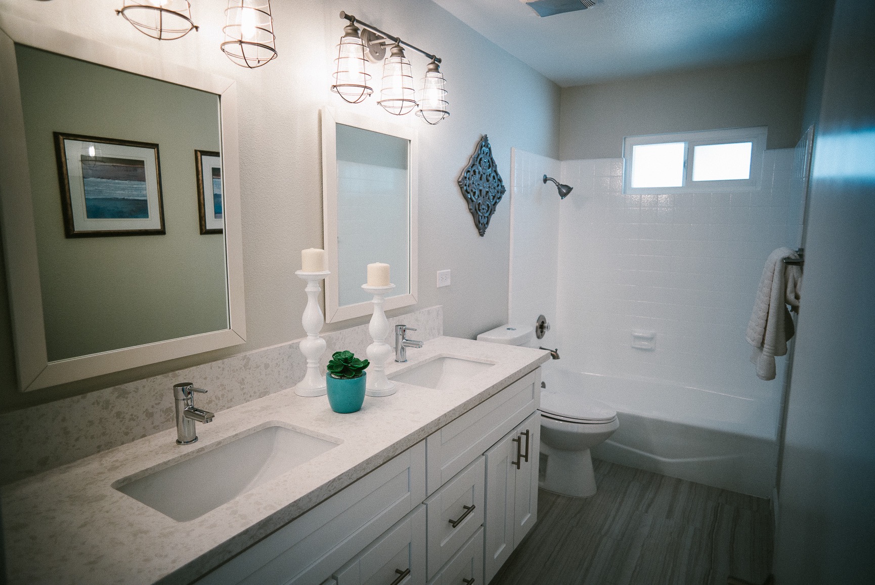
Luckily for us, the secondary bathroom had a pretty good layout and size to it, so nothing really had to be done other than putting in new cabinets, plumbing and fittings. It might seem to be a little extreme changing out every single angle stop in the house, but we have learned over the years that old angle stop are literally the most fragile mechanisms on earth. Old angle stops that haven’t been touched in years can and will suddenly spring a leak if someone so much as looks at it. The terror of a leaking angle stop destroying our new cabinets has never appealed to me, so every house gets new angle stops and fittings.
New light fittings with Edison bulbs were installed for some architectural interests.
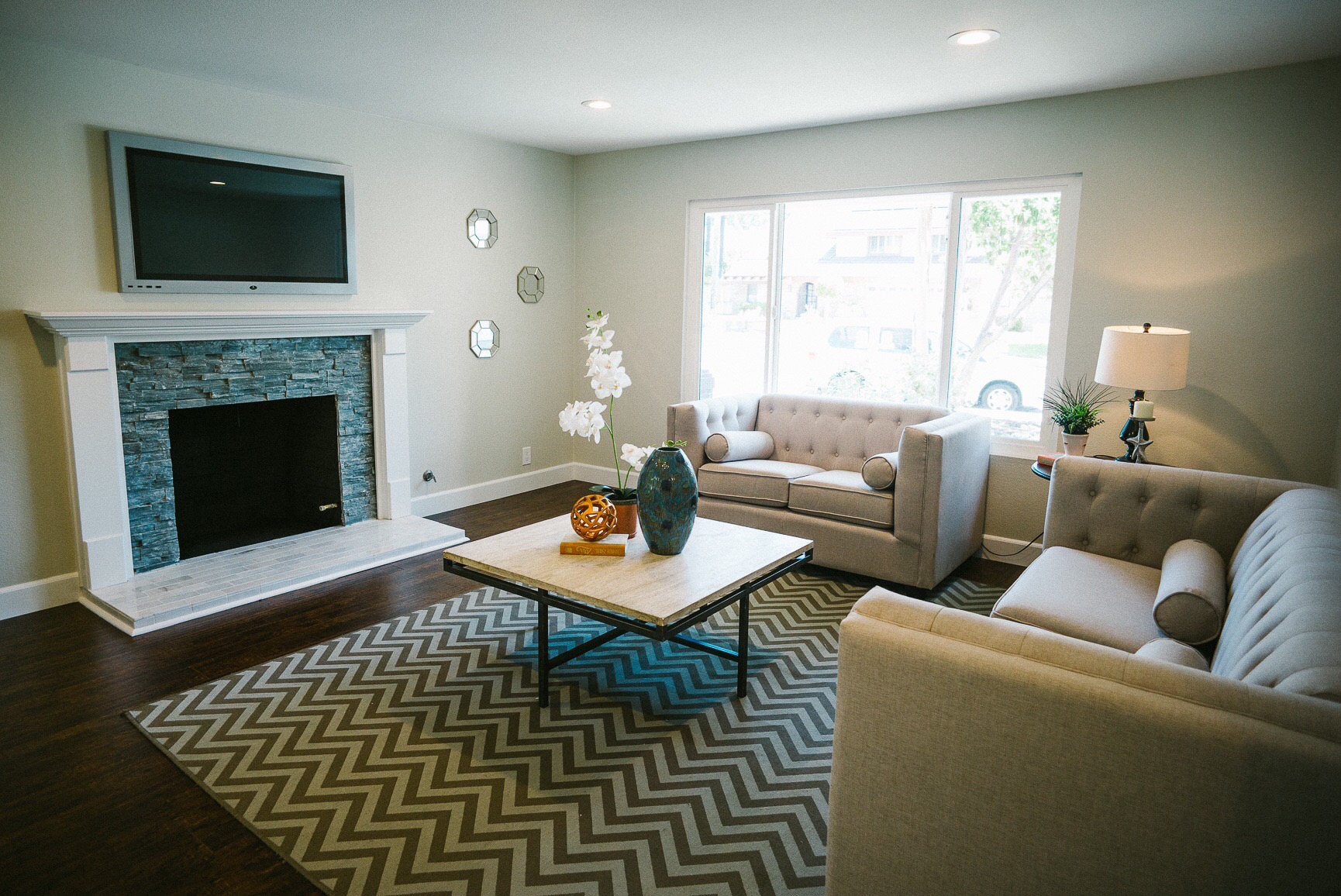
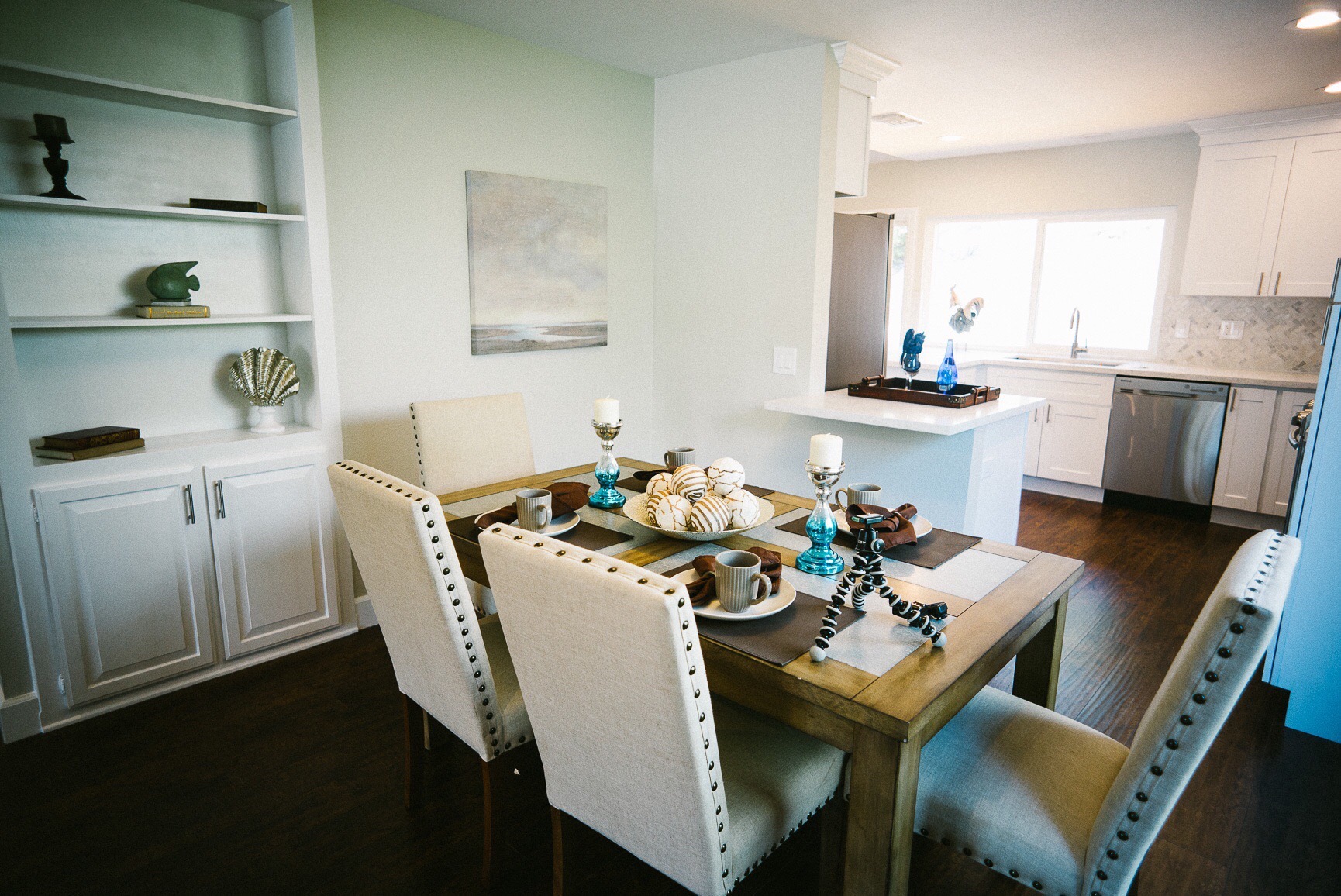
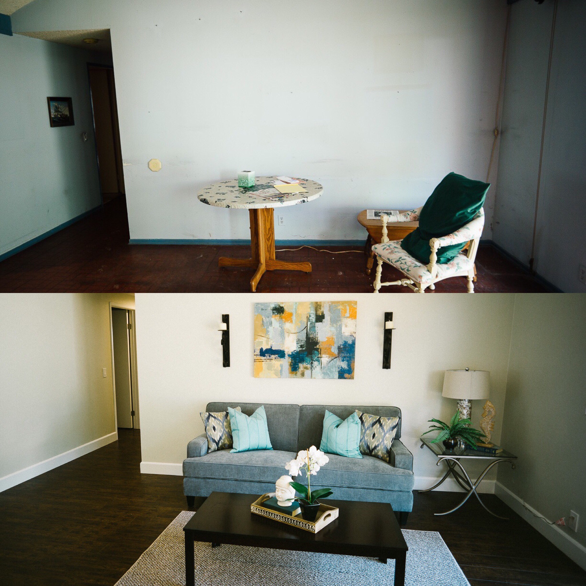
With the completion of the master bath, most of the major work was done. Beyond that, it was a matter of throwing down new flooring, new baseboards, new interior and exterior paint and updating the electrical.
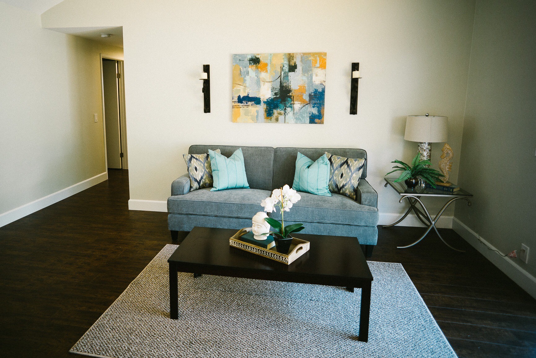
After it was done, the house was staged to really show off the potential of the living space. All in all, despite the cost over run and longer than expected project time, this was probably one of our smoother flips.
To really see the difference, see below for before and after photos.
